


During the holiday season, there’s a lot competing for our attention: Shopping. Parties. Family events. How do you convince people to make time for one more thing? You turn it into a can’t-miss tradition. For Ice on Main, our marketing has elevated the brand and the experience beyond ice skating and evolved the rink into an annual tradition, an iconic part of the season and a memory-making “must do.”
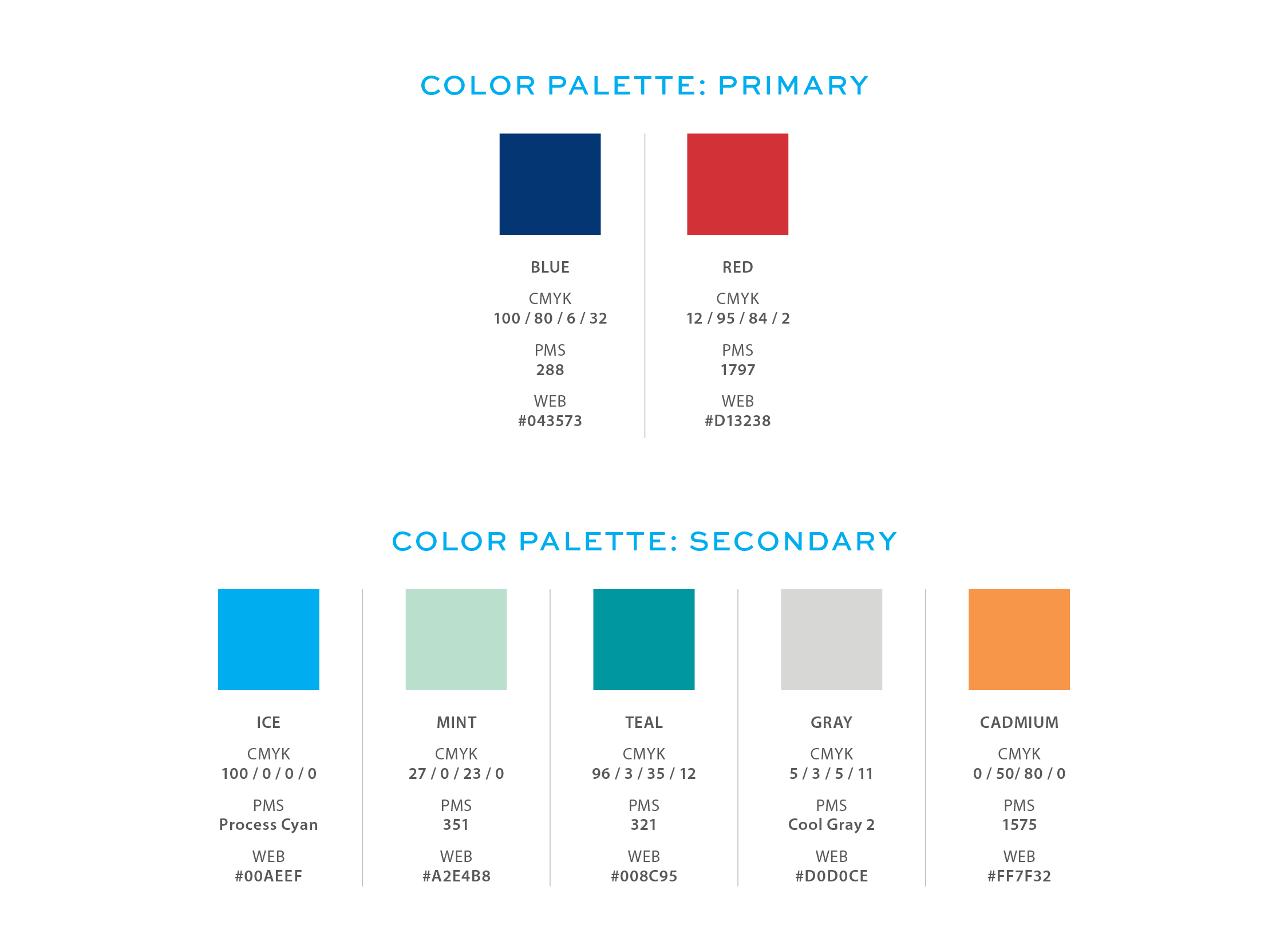
The dark blue offers a very versatile base color with pops of red in the logo for energy and excitement. The supporting colors are softer to complement such a strong primary palette. The crisp, light, and airy secondary palette is designed to better promote the ambiance of the season.
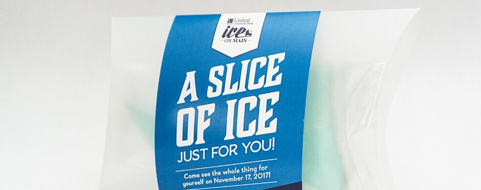
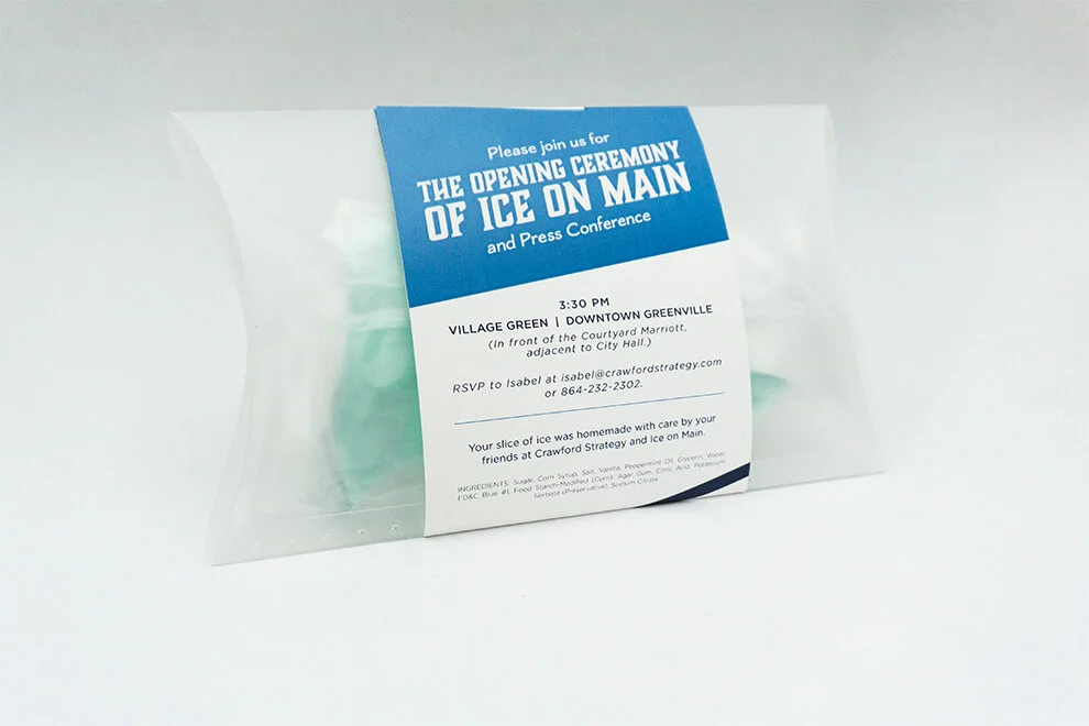
Candied sugar was sliced into pieces of “ice” offering media a piece of the action and inviting them to see the whole thing.
ROLES:
Art Direction & Design
New Logo Design, Campaign Concept Development, Design of all Print and Digital Marketing, Signage Design, Concept Development, Design, and Implementation of Media Invites, Opening Ceremony Photography